AppNet Client News Mar 6 2014
Mobile Friendly Design is Easier than Ever
The number of people searching and surfing the net via mobile devices is growing faster than any other part of our society as a whole. In fact, last month one news reporting service shared the fact that for the first time in HISTORY – more people checked their emails on mobile devices than desktop computers.
Industry insiders are saying that on average now anywhere from a LOW of 20-25% to as HIGH as 40% of your website visitors are attempting to look at your website on their iPhones, SmartPhones, Androids, iPads, etc.
Mobile technologies have grown far faster than web browser technologies in that all websites can “kind of” be viewed. However – the majority of websites are NOT mobile optimized.
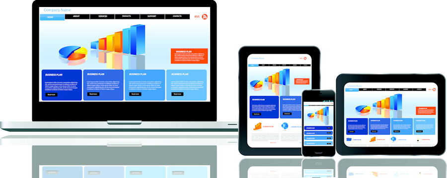
Enter RESPONSIVE WEB DESIGN….
It’s been around for a few years now, but it was the FASTEST, MOST USED trend in web design in 2013 and for good reason. The platform allows web developers like us to build a website in a way that “redesigns” itself for any device attempting to view your website. That is far more cost-effective than attempting to redesign a separate website for each device – not to mention trying to keep up with each.
RWD allows us to build sites that provide an optimal viewing experience across a wide range of devices—whether you’re on a smartphone, a 27″ monitor or a 60” flat-screen television. Responsive Web Design allows for ease-of-reading and simple navigation on any device without requiring your visitors the chore of resizing, panning left-to-right and scrolling endlessly up and down on smaller devices.
Call AppNet today at 888-926-4584 to discuss how best to bring your website up to industry standards AND to connect with your mobile audience.