IF YOUR WEBSITE ISN’T MOBILE FRIENDLY, YOU ARE LOSING CUSTOMERS
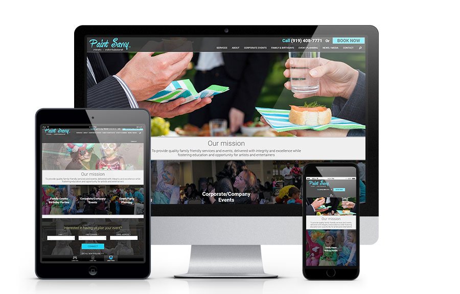
TOP REASONS YOUR BUSINESS WEBSITE SHOULD BE MOBILE OPTIMIZEDThese are probably two of the top ten most blogged subjects on the internet right now when it comes to related content about SEO, WEBSITE VISITATION, etc. The numbers are “all over the place” in terms of how people are surfing the net these days. What is undeniable however is that more and more of them are “Googling” from their mobile devices.We run Google Analytics on most all of our clients websites if you compare month to month over the last year you will most often see that people are trending to visiting websites via the iPhones, Androids, tablets, iPads, etc…In May of 2013 we emailed all of our business clients that we were seeing anywhere from 15-22% of website visitors “going mobile”. Over the last couple of years that trend definitely influenced more and more savvy business owners to make certain that their websites were at the very least “mobile friendly”. What that term meant in 2012 is totally different in 2014.Mobile providers found that the internet wasn’t keeping up with mobile technologies so they basically made their devices “mobile okay” in that you’d simple see a smaller version of what you’d see on a desktop. People became pretty savvy on how to manuever around websites on their smartphones, etc. A little scrolling left-to-right and a little “thumb and forefingering” would allow you to enlarge about any website to be viewable.Then in 2013 the largest web development trend was to create “Responsive Websites”. Through a little CSS developers basically began creating websites that in layman’s terms “redesigned themselves” depending on what device was hitting it. If you were on a smartphone, it displayed the site with easy mobile navigation and eliminated the pesky side-to-side scrolling. MOST business websites ARE NOT mobile optimized or responsive…and if YOURS is one of those…then you’re simply making it easy for your competitor to get more of that traffic because THEIR website is making it easier for visitors to navigate.…AND THE NUMBERS ARE BEGINNING TO MUSHROOM…Ask yourself how often you check email on your desktop these days. When you’re at home, how often do you go and sit down at your old desktop? Instead, now you simply reach for your phone, Ipad or tablet, right?So is everyone else!So let’s go back to May 2013 when we emailed our clients and informed them that from 15-22% of their visitors were hitting their websites from mobile devices. Want to know what the numbers look like NOW?They are trending to be around 40% now! We reviewed one, attraction type client last week and found that 45% of their visitors over the last month were from either a tablet or phone. We also own a website called ResortCams.com that shows LIVE VIDEO STREAMS from vacation destinations across North and South America and over the last month we found that of the NEW VISITORS who were coming to our website for the first time – 44% of them were on mobile devices compared to 33% that were confirmed to be on desktops.A responsive web design (RWD) is more important now than ever, with the number of mobile and tablet users continuing to increase at a very rapid rate. You spend a lot of time and money on search engine optimization, online marketing, pay per click advertising, and various other methods to drive traffic to your website. If your website does not provide the visitor with a pleasant experience, allowing him or her to quickly locate information and carry out a conversion, then you are flushing your advertising dollars down the toilet.Some website owners are still going with the “AUTO DETECTION MODE” for pushing visitors to a desktop vs mobile version however Google recently wrote:Responsive design serves the same HTML for one URL and uses CSS media queries to determine how the content is rendered on the client side. This removes the possible glitches of user-agent detection and frees users from redirects. This is Google’s recommended configuration.This alone should get your attention. If your website is not a responsive design, converting to one should now be priority number one on your to-do list! The most recent data or Google searches for – Mobile website traffic 2014 – is showing that nearly 40% of traffic to nearly any website is from mobile.Obviously you want to make your website EASY for every visitor because that creates higher conversion rates. Here are some of the benefits:1. Easy NavigationA responsive design allows your users to quickly access your main menu and all sections of your website simply by scrolling up and down, and NOT having to enlarge the screen or move it around in order to access areas. If your website is a nightmare to navigate your visitors are going to bounce off quickly and find a competing website that gives them a pleasant mobile experience.2. Quick Tap Phone CallA mobile friendly website is especially important for local businesses that are attracting impulse searches by individuals on their mobile phones. Make it simple for the visitor to call your business. It is amazing how many websites do not display their number at the very top for mobile visitors. Often times a local search is being performed to obtain your phone number, so make sure you provide it to your visitor right at their finger tips. This is a great way to get your phone ringing with interested consumers!3. Simple ContactLike mentioned above, a large percentage of local searches are done in order to contact the business. Make sure to include an easily accessible contact form for those that land on your website after business hours or would prefer to send in a request rather than call. Mobile searchers are using their devices on the go, so make sure they can easily get in touch with you.4. Leads, Leads, and More LeadsYour website is a platform to display your products or services, but it is also a very powerful lead generator. Take advantage of your traffic and set up multiple calls-to-action designed to capture the email and name of as many visitors as possible. This list of leads can then be marketed to in the future. Constantly building your marketing list ensures that you always have warm bodies to market your products or services to. If your website isn’t mobile friendly your users are not likely to submit their information no matter how enticing your offer is. If they have to expand your page and make it around to fill out your form then you are missing a lot of opportunities.Contact us at AppNet.com at 888-926-4584 and let us quote you on how to convert your website into a more friendly, responsive website. We rank at the top of Google for search engine ranking and optimization and we’ll create a strategy for your business to get you generating more customers – tomorrow.